04 - CSS 进阶
选择器 2
复合选择器
- 复合选择器是由多个简单选择器组合而成的,通过它们可以更精确地定位需要样式化的元素。
- 复合选择器允许你根据元素的属性、类型、关系和状态等条件来选择元素。
- 后代选择器(Descendant Selector): 选择某个元素的后代元素,通过空格分隔。例如
div p会选择所有在div元素内部的p元素。 - 子元素选择器(Child Selector): 选择某个元素的直接子元素,通过
>分隔。例如ul > li会选择ul元素下的直接子元素li。 - 相邻兄弟选择器(Adjacent Sibling Selector): 选择某个元素的紧邻后面的兄弟元素,通过
+分隔。例如h2 + p会选择紧跟在h2元素后的p元素。 - 一般兄弟选择器(General Sibling Selector): 选择某个元素之后的所有兄弟元素,通过
~分隔。例如h2 ~ p会选择所有在h2元素后的p元素。 - 并集选择器(Union Selector): 并集选择器允许你将多个不同选择器组合起来,选择这些选择器所匹配的所有元素,然后对它们应用相同的样式。例如
selector1, selector2会选择所有匹配selector1或selector2的元素。 - 交集选择器(Intersection Selector): 交集选择器允许你将多个选择器组合起来,选择同时匹配所有这些选择器的元素,然后对它们应用相同的样式。例如
selector1.selector2会选择所有同时匹配selector1和selector2的元素。
<!DOCTYPE html>
<html>
  <head>
    <style>
      /* 后代选择器 */
      div p {
        color: blue;
      }

      /* 子元素选择器 */
      ul > li {
        list-style-type: square;
      }

      /* 相邻兄弟选择器 */
      h2 + p {
        font-weight: bold;
      }

      /* 一般兄弟选择器 */
      h2 ~ p {
        font-style: italic;
      }

      /* 并集选择器 */
      h1,
      h2 {
        color: blue;
      }

      /* 交集选择器 */
      .btn.success {
        background-color: green;
        color: white;
      }
    </style>
  </head>
  <body>
    <div>
      <p>This is a paragraph inside a div.</p>
    </div>

    <ul>
      <li>List item 1</li>
      <li>List item 2</li>
    </ul>

    <h2>Title</h2>
    <p>This paragraph is adjacent to the h2.</p>
    <p>This paragraph is a general sibling of the h2.</p>

    <h1>This is a heading 1.</h1>
    <h2>This is a heading 2.</h2>
    <button class="btn success">Success Button</button>
    <button class="btn">Regular Button</button>
  </body>
</html>
伪类选择器
-
伪类选择器是一种用于选择元素的特殊状态或位置的 CSS 选择器。它们允许你对元素的不同状态或位置应用样式,例如当鼠标悬停在元素上、元素是第一个子元素、元素是链接等情况下。
-
:hover伪类选择器是 CSS 中一种用于选择鼠标悬停在元素上时的状态的选择器。当用户将鼠标悬停在一个元素上时,可以使用:hover伪类选择器为该元素应用样式,以提供视觉反馈或创建交互效果。 -
通过为元素的
:hover状态定义样式,可以在用户与页面交互时改变元素的外观,从而增强用户体验。常见的应用包括:- 链接状态: 将链接在鼠标悬停时改变颜色或添加下划线,以表明它们是可点击的。
- 按钮效果: 当鼠标悬停在按钮上时,可以改变按钮的背景颜色或添加阴影,以指示按钮可以被点击。
- 导航菜单: 在导航菜单上应用
:hover样式,当用户悬停在菜单项上时,突出显示当前选择的项目。
<!DOCTYPE html> <html> <head> <style> /* 链接在悬停状态下改变颜色和下划线 */ a:hover { color: blue; text-decoration: underline; } /* 按钮在悬停状态下改变背景颜色 */ .button { padding: 10px 20px; background-color: #007bff; color: white; border: none; cursor: pointer; } .button:hover { background-color: #0056b3; } </style> </head> <body> <p>Hover over this <a href="#">link</a> to see the effect.</p> <button class="button">Hover me</button> </body> </html> -
超链接(链接)伪类选择器是一种特殊的 CSS 选择器,用于选择不同状态下的超链接元素。这些状态包括未访问、已访问和鼠标悬停等,你可以根据不同状态来定义超链接的样式。
-
常见超链接伪类选择器
:link: 选择未访问的超链接。:visited: 选择已访问过的超链接。:hover: 选择鼠标悬停在超链接上时的状态。:active: 选择鼠标点击超链接时的状态。
-
状态顺序: 当为超链接定义样式时,通常建议按照
:link、:visited、:hover、:active的顺序排列。 -
样式继承: 超链接的伪类样式可能会受到浏览器的默认样式或其他样式表的影响,你可以使用
!important关键字来提高特定样式的优先级。 -
访问顺序: 浏览器会根据链接的访问顺序确定哪些链接是已访问的。在开发阶段,你可以手动清除浏览器的历史记录来测试
:visited样式。<!DOCTYPE html> <html> <head> <style> /* 未访问的超链接 */ a:link { color: blue; text-decoration: none; } /* 已访问的超链接 */ a:visited { color: purple; text-decoration: none; } /* 鼠标悬停在超链接上时 */ a:hover { color: red; text-decoration: underline; } /* 鼠标点击超链接时 */ a:active { color: green; } </style> </head> <body> <p>Check out these <a href="#">links</a> to see the effects.</p> <p>You can also <a href="#">click here</a> to test the active effect.</p> </body> </html>
CSS 三大特性
在前端开发中,CSS(层叠样式表)是用于控制网页的样式和布局的标记语言。CSS 具有三大特性,即层叠性、继承性和优先级。
层叠性 Cascading
层叠性是 CSS 的核心特性之一,它允许多个样式规则同时应用于一个元素,从而形成一个最终的样式。层叠性通过一组规则来确定哪些样式具有更高的优先级,以及如何解决冲突。这些规则包括选择器的特定性、位置和样式表中的顺序等。
- 特定性: CSS 选择器的特定性是一个权重值,用于决定哪些规则更具优先级。通常,ID 选择器的特定性最高,其次是类选择器、属性选择器,最后是元素选择器。
- 位置: 如果有多个相同特定性的规则应用于同一个元素,后面的规则将覆盖先前的规则。这就是 " 层叠 " 的含义。
继承性 Inheritance
- 继承性是指某些属性的值会从父元素传递到子元素。当一个元素没有显式设置某个属性的值时,浏览器会查找父元素是否设置了该属性,如果有,则子元素继承父元素的属性值。
- 常见继承的属性包括字体、颜色、行高、文本对齐等。但并非所有属性都具有继承性,一些布局和盒模型属性通常不会被子元素继承。
优先级 Specificity
- 优先级是用于解决样式规则冲突的机制。当多个规则都可以应用到一个元素时,浏览器通过计算选择器的特定性来决定应用哪个规则。
- 选择器的特定性通常用一个四元组表示,分别表示内联样式、ID 选择器、类/属性/伪类选择器和元素选择器的数量。例如,选择器
div#header .title的特定性是(0, 1, 1, 2)。
优先级的计算规则
选择器优先级通常用一个四元组(a, b, c, d)来表示,其中:
- a 表示内联样式的数量
- b 表示 ID 选择器的数量
- c 表示类、属性和伪类选择器的数量
- d 表示元素和伪元素选择器的数量
在比较两个选择器的优先级时,通常从左到右逐个比较上述四个值,直到找到一个值不相等的情况为止。较大的值表示较高的优先级。例如,选择器 .navbar ul li 的优先级为 (0, 0, 3, 1),而选择器 #header .title 的优先级为 (0, 1, 1, 2)。因此,#header .title 具有更高的优先级。
公式: !important > 行内样式 > id 选择器 > 类选择器 > 标签选择器> 通配符选择器 (选中标签的范围越大,优先级越低)
优先级的注意事项
- 内联样式最高: 内联样式的优先级最高,因此它会覆盖其他所有类型的样式。
- 避免过度使用 ID 选择器: 由于 ID 选择器的特定性较高,它们的样式会比较强大,但过度使用会增加样式冲突的风险。应尽量使用类选择器和其他类型的选择器来提高样式的可维护性。
- 避免使用
!important:!important标志会使样式具有最高的优先级,但它容易导致样式的混乱和难以预测的结果。应该尽量避免使用它,除非在极端情况下。 - 继承权重最低。
<!DOCTYPE html>
<html>
  <head>
    <style>
      /* ID 选择器的优先级高于类选择器 */
      #header {
        color: blue;
      }

      .title {
        color: red;
      }

      /* 类选择器的优先级高于元素选择器 */
      .navbar ul li {
        font-weight: bold;
      }

      /* 元素选择器 */
      p {
        font-style: italic;
      }
    </style>
  </head>
  <body>
    <div id="header" class="navbar">
      <ul>
        <li class="title">List Item 1</li>
        <li>List Item 2</li>
      </ul>
    </div>

    <p>This is a paragraph.</p>
  </body>
</html>
Emmet 写法
-
Emmet 是一种用于加速前端开发的文本缩写工具,它可以让你以简洁、快速的方式生成 HTML 和 CSS 代码。
-
Emmet 的核心思想是通过简短的缩写表达方式来生成冗长的代码,从而提高生产效率。
-
Emmet 的语法和规则可以帮助开发者更快速地编写 HTML 和 CSS 代码,特别是在需要大量重复结构的情况下。在支持 Emmet 的编辑器中,可以通过编写缩写,然后按下特定的快捷键(通常是
Tab键)来展开生成完整的代码。这可以显著提高开发者的开发速度和效率。 -
基本结构标记:
-
!:生成一个基本的 HTML 骨架。! → <!DOCTYPE html> <html lang="en"> <head> <meta charset="UTF-8" /> <meta name="viewport" content="width=device-width, initial-scale=1.0" /> <title></title> </head> <body></body> </html>
-
-
元素:
-
element:生成一个指定名称的 HTML 元素。div → <div></div> p → <p></p> -
element.class:生成带有指定类名的 HTML 元素。div.container → <div class="container"></div> -
element#id:生成带有指定 id 的 HTML 元素。input#username → <input id="username" />
-
-
嵌套:
-
parent>child:生成嵌套的 HTML 结构。ul>li*3 → <ul> <li></li> <li></li> <li></li> </ul>
-
-
多个元素:
-
element*count:生成多个相同的 HTML 元素。li.item$*5 → <li class="item1"></li> <li class="item2"></li> <li class="item3"></li> <li class="item4"></li> <li class="item5"></li> table>tr*3>td.cell$*4 → <table> <tr> <td class="cell1"></td> <td class="cell2"></td> <td class="cell3"></td> <td class="cell4"></td> </tr> <tr> <td class="cell1"></td> <td class="cell2"></td> <td class="cell3"></td> <td class="cell4"></td> </tr> <tr> <td class="cell1"></td> <td class="cell2"></td> <td class="cell3"></td> <td class="cell4"></td> </tr> </table>
-
-
分组:
-
(element1…)+(element2…):将多个元素组合在一起。(header>h1)+(nav>ul>li*3>a)+(section>h2)+(article>h3)+(footer>h4) → <header> <h1></h1> </header> <nav> <ul> <li><a href=""></a></li> <li><a href=""></a></li> <li><a href=""></a></li> </ul> </nav> <section> <h2></h2> </section> <article> <h3></h3> </article> <footer> <h4></h4> </footer>
-
-
文本内容:
-
element{content}:生成带有指定文本内容的 HTML 元素。a{Click me} → <a href="#">Click me</a> p{Hello World} → <p>Hello World</p>
-
-
属性:
-
element[attribute=value]:生成带有指定属性的 HTML 元素。a[href=https://example.com] → <a href="https://example.com"></a> ul.task-list>li.task-item*5>input[type="checkbox"]+span.task-name → <ul class="task-list"> <li class="task-item"><input type="checkbox" /><span class="task-name"></span></li> <li class="task-item"><input type="checkbox" /><span class="task-name"></span></li> <li class="task-item"><input type="checkbox" /><span class="task-name"></span></li> <li class="task-item"><input type="checkbox" /><span class="task-name"></span></li> <li class="task-item"><input type="checkbox" /><span class="task-name"></span></li> </ul>
-
-
CSS 缩写:
m10:设置margin为10px。p20:设置padding为20px。bg-red:设置背景颜色为红色。
背景属性
背景图 background-image
-
使用
background-image属性为元素设置背景图片。 -
语法:
background-image: url("image.jpg");。url("image.jpg")是图像文件的路径,可以是相对路径或绝对路径。<!DOCTYPE html> <html> <head> <style> .container { width: 400px; height: 300px; background-image: url("image.jpg"); } </style> </head> <body> <div class="container"></div> </body> </html>
背景平铺方式 background-repeat
- 使用
background-repeat属性用于控制背景图的平铺方式。背景图默认会在元素内部水平和垂直方向重复平铺。 - 语法:
background-repeat: value;
| 取值 | 描述 |
|---|---|
repeat |
背景图像会在水平和垂直方向上重复平铺,直到整个背景区域被填满。 |
repeat-x |
背景图像只会在水平方向上重复平铺。 |
repeat-y |
背景图像只会在垂直方向上重复平铺。 |
no-repeat |
背景图像不会重复,只显示一次。 |
round |
背景图像会在水平和垂直方向上重复平铺,但是最后一个图像片段的大小会进行缩放以填满整个背景区域。 |
space |
背景图像会在水平和垂直方向上重复平铺,但是会在图像之间留下空白间隔以填满整个背景区域。 |
<!DOCTYPE html>
<html>
  <head>
    <style>
      .container {
        width: 400px;
        height: 300px;
        background-image: url("image.jpg");
        background-repeat: no-repeat; /* 禁止背景图的平铺 */
      }
    </style>
  </head>
  <body>
    <div class="container"></div>
  </body>
</html>
背景图位置 background-position
| 取值 | 描述 |
|---|---|
top |
将背景图像定位在背景区域的顶部中心。 |
bottom |
将背景图像定位在背景区域的底部中心。 |
left |
将背景图像定位在背景区域的左侧中心。 |
right |
将背景图像定位在背景区域的右侧中心。 |
center |
将背景图像水平和垂直居中定位。 |
<percentage> |
可以使用任何百分比值,用于在水平和垂直方向上设置背景图像的偏移量。 0% 表示背景图像在该方向上的起始位置,100% 表示背景图像在该方向上的结束位置。 |
<length> |
可以使用任何长度值,用于在水平和垂直方向上设置背景图像的偏移量。 正的长度值将背景图像向右或向下移动,负的长度值将背景图像向左或向上移动。 |
top left |
同时设置背景图像在水平和垂直方向上的位置为左上角。 |
top right |
同时设置背景图像在水平和垂直方向上的位置为右上角。 |
bottom left |
同时设置背景图像在水平和垂直方向上的位置为左下角。 |
bottom right |
同时设置背景图像在水平和垂直方向上的位置为右下角。 |
<!DOCTYPE html>
<html>
  <head>
    <style>
      .container {
        width: 400px;
        height: 300px;
        background-image: url("image.jpg");
        background-position: center center; /* 将背景图居中显示 */
      }
    </style>
  </head>
  <body>
    <div class="container"></div>
  </body>
</html>
背景图大小 background-size
| 取值 | 描述 |
|---|---|
auto |
默认值,保持背景图像的原始大小。 |
cover |
背景图像会被缩放到完全覆盖背景区域,可能会被裁剪。 |
contain |
背景图像会被缩放到完全包含在背景区域中,可能会有留白。 |
<length> |
指定背景图像的宽度和高度,可以使用像素值、百分比值或其他长度单位。 |
<percentage> |
相对于背景区域的百分比值,以背景区域的宽度和高度作为参考。 |
工作中,图片比例与盒子比例相同,使用 cover 或 contain 缩放背景图效果相同。
<!DOCTYPE html>
<html>
  <head>
    <style>
      .container {
        width: 400px;
        height: 300px;
        background-image: url("image.jpg");
        background-size: cover; /* 使背景图完全覆盖容器,并可能进行裁剪 */
      }
    </style>
  </head>
  <body>
    <div class="container"></div>
  </body>
</html>
背景图滚动 background-attachment
| 取值 | 描述 |
|---|---|
scroll |
默认值,背景图像会随着页面的滚动而滚动。 |
fixed |
背景图像会固定在页面的视口中,不会随滚动而滚动。 |
local |
背景图像会随着元素内容的滚动而滚动,而不是整个页面的滚动。 |
<!DOCTYPE html>
<html>
  <head>
    <style>
      .container {
        width: 400px;
        height: 300px;
        background-image: url("image.jpg");
        background-attachment: fixed; /* 使背景图固定在容器中,不随页面滚动而移动 */
      }
    </style>
  </head>
  <body>
    <div class="container"></div>
    <p>This is some content that will scroll.</p>
  </body>
</html>
背景图定位原点 background-origin
| 描述 | |
|---|---|
padding-box |
背景图像绘制和定位参照的是元素的 padding 区域。 |
border-box |
背景图像绘制和定位参照的是元素的 border 区域。 |
content-box(默认值) |
背景图像绘制和定位参照的是元素的 content 区域。 |
<!DOCTYPE html>
<html>
  <head>
    <style>
      .container {
        width: 400px;
        height: 300px;
        padding: 20px;
        border: 2px solid #333;
        background-image: url("image.jpg");
        background-origin: content-box; /* 背景图从内容区域开始绘制*/
        background-size: cover;
      }
    </style>
  </head>
  <body>
    <div class="container"></div>
  </body>
</html>
背景图绘制边界 background-clip
| 属性值 | 描述 |
|---|---|
border-box(默认值) |
背景图像在元素的 border 区域和内边距区域之间绘制。 |
padding-box |
背景图像在元素的内边距区域和内容区域之间绘制。 |
content-box |
背景图像在元素的内容区域中绘制。 |
text |
背景图像仅限于元素文本内容的后面,不绘制背景在元素的其他部分。 通常搭配 color: transparent; 使文本透明以显示背景图 |
<!DOCTYPE html>
<html>
  <head>
    <style>
      .container {
        width: 400px;
        height: 300px;
        padding: 20px;
        border: 2px solid #333;
        background-image: url("image.jpg");
        background-clip: content-box; /* 将背景图定位区域设置为内容区域 */
        background-size: cover;
      }
    </style>
  </head>
  <body>
    <div class="container"></div>
  </body>
</html>
背景复合属性 background
- 语法:
background: [background-color] [background-image] [background-repeat] [background-attachment] [background-position] / [background-size] [background-origin] [background-clip] [background-blend-mode]; - 每个子属性可以按任意顺序组合,并且可以选择性地省略不使用的子属性。但是,
background-image和background-position必须至少指定一个值。
| 子属性 | 描述 |
|---|---|
background-color |
设置元素的背景颜色。可以使用颜色名称、十六进制码、RGB、RGBA、HSL 或 HSLA 值来指定背景颜色。 |
background-image |
指定要用作背景图像的图像路径或渐变效果。使用逗号分隔多个图像,层叠显示。可以使用图像的 URL 或者渐变的 CSS 函数,如 linear-gradient() 或 radial-gradient()。 |
background-repeat |
指定背景图像的重复方式。可选值包括 repeat(默认),repeat-x,repeat-y 和 no-repeat。 |
background-position |
指定背景图像的起始位置。可使用关键词(如 top,bottom,left,right)或具体的像素值。 |
background-size |
指定背景图像的大小调整方式。可选值包括 auto,cover,contain, <length> 和 <percentage>。 |
background-attachment |
指定背景图像的滚动方式。可选值包括 scroll(默认),fixed 和 local。 |
background-origin |
指定背景图像的定位原点。可选值包括 padding-box(默认),border-box 和 content-box。 |
background-clip |
指定背景图像的绘制边界。可选值包括 border-box(默认),padding-box 和 content-box。 |
background-blend-mode |
指定背景颜色和背景图像之间的混合模式。可选值包括如 multiply,screen,overlay 等 CSS 属性。 |
<!DOCTYPE html>
<html>
  <head>
    <style>
      .container {
        width: 400px;
        height: 300px;
        /* 指定了图像的路径、位置为居中、大小为覆盖 cover 以及不进行重复 no-repeat */
        background: url("image.jpg") center center / cover no-repeat;
      }
    </style>
  </head>
  <body>
    <div class="container"></div>
  </body>
</html>
显示模式
| 特点 | 块级元素 | 行内元素 | 行内块元素 |
|---|---|---|---|
| 样式表现 | - 独占一行,自上而下排列。 - 可以设置宽度、高度、外边距、内边距等样式属性。 - 默认情况下,块级元素会占据父元素的全部宽度。 | - 不独占一行,与其他行内元素在同一行内显示。 - 不可以设置宽度、高度、外边距、内边距等样式属性。 - 适用于需要在段落、标题、列表等在新行展示的元素。 | - 不独占一行,与其他文本或行内元素在同一行内显示。 - 可以设置宽度、高度、外边距、内边距等样式属性。 - 整个行内块元素的高度由文本的字号和行高(line-height)决定。 - 适用于需要在行内展示块级元素,并且需要设置宽度、高度等样式属性。 |
| 默认宽度 | 占据父元素的全部宽度 | 根据内容或其他样式属性决定 | 根据内容或其他样式属性决定 |
| 默认高度 | 根据内容或其他样式属性决定 | 根据内容或其他样式属性决定 | 根据内容或其他样式属性决定 |
| 浮动与定位行为 | 按照正常文档流排列,不会浮动或定位 | 按照正常文档流排列,不会浮动或定位 | 按照正常文档流排列,不会浮动或定位 |
| 内容默认换行 | 自动换行 | 内容顺序自动换行 | 内容顺序自动换行 |
| 是否可以容纳其他元素或内容 | 可以容纳其他块级元素、行内元素、行内块元素、甚至是文本等等 | 可以容纳其他行内元素、文本等 | 可以容纳其他行内元素、文本等 |
| 可变宽度和高度 | 可以通过设置宽度、高度、百分比等样式属性来改变宽度和高度 | 不可以直接设置宽度和高度,而是通过设置其他样式属性如 padding 和 border 等间接影响宽度和高度 | 可以通过设置宽度、高度、百分比等样式属性来改变宽度和高度 |
<!DOCTYPE html>
<html>
<head>
    <style>
        .inline {
            display: inline;
            border: 1px solid red;
            margin: 5px;
        }

        .block {
            display: block;
            border: 1px solid green;
            margin: 5px;
        }

        .inline-block {
            display: inline-block;
            border: 1px solid blue;
            margin: 5px;
        }
    </style>
</head>
<body>
    <span class="inline">Inline Element</span>
    <div class="block">Block-level Element</div>
    <img src="image.jpg" alt="image" class="inline-block">
</body>
</html>
块级元素 Block-level Elements
- 每个块级元素都会独占一行,即元素之间会自动换行。
- 块级元素的宽度默认是占据父元素的全部可用宽度(除非显式设置宽度)。
- 可以设置宽度、高度、外边距(margin)、内边距(padding)等样式属性。
- 常见的块级元素有
<div>、<p>、<h1>到<h6>、<ul>、<ol>、<li>等。
| 标签 | 作用 | 示例 |
|---|---|---|
<div> |
用于将文档分割为独立的、有意义的区域,常用于布局目的,可以包含其他块级或行内元素。 | <div id="header">…</div> |
<p> |
用于段落文本,自动在段前和段后添加间距,并可能保留字词自动换行。 | <p>This is a paragraph.</p> |
<h1>-<h6> |
用于标题文本,<h1> 为最高级别标题,<h6> 为最低级别标题,按重要性逐级降低。 |
<h1>Heading 1</h1> |
<ul> |
用于创建无序列表,列表项使用 <li> 标签包裹。 |
<ul><li>Item 1</li><li>Item 2</li></ul> |
<ol> |
用于创建有序列表,列表项使用 <li> 标签包裹,每个列表项会自动带有排序数字或字母。 |
<ol><li>Item 1</li><li>Item 2</li></ol> |
<table> |
用于创建表格,包含 <thead>、<tbody> 和 <tfoot> 三个部分,使用 <tr> 标签定义表格行,<th> 用于表格标题列,<td> 用于普通表格列。 |
<table><tr><th>Header 1</th><th>Header 2</th></tr><tr><td>Data 1</td><td>Data 2</td></tr></table> |
<form> |
用于创建表单,包含输入元素,使用 <input> 标签定义输入框、按钮等,可以使用 <label> 标签为输入元素添加标签。 |
<form><input type="text" name="name" /><input type="submit" value="Submit" /></form> |
<address> |
用于包含联系信息,浏览器会将此标签中的文本呈现为斜体,并添加默认的间距。 | <address>John Doe<br />example@example.com</address> |
<blockquote> |
用于引用长段文字,浏览器会自动添加缩进、上下文间距和斜体样式。 | <blockquote>This is a long quote.</blockquote> |
行内元素 Inline Elements
- 行内元素不会独占一行,而是与其他文本或行内元素在同一行内显示。
- 行内元素的宽度由内容决定,不能设置宽度、高度、外边距等块级元素特有的样式属性。
- 整个行内元素的高度由文本的字号和行高(line-height)决定。
- 常见的行内元素有
<span>、<a>、<img>、<input>、<strong>、<em>、<code>等。
| 标签 | 作用 | 示例 |
|---|---|---|
<span> |
用于为文本的特定部分或内联元素添加样式或标记,不会产生新的行。 | <span class="highlight">Highlighted Text</span> |
<a> |
用于创建链接,可以是内部链接或外部链接,常用于导航菜单、文章内部链接等。 | <a href="https://example.com">Visit Example Website</a> |
<img> |
用于插入图像,用于显示图片,可以设置图片的来源、大小和替代文本等属性。 | <img src="image.jpg" alt="Example Image" width="300" height="200" /> |
<input> |
用于创建输入字段,可以是文本输入框、单选按钮、复选框、提交按钮等等。 | <input type="text" name="name" /> |
<button> |
用于创建按钮,常用于提交表单或执行特定的 JavaScript 操作。 | <button onclick="myFunction()">Click Me</button> |
<label> |
用于为表单元素添加标签,当用户点击标签时,关联的表单元素会获得焦点或执行特定操作。 | <label for="input">Name:</label><input type="text" id="input" /> |
<strong> |
用于强调文本,浏览器会以粗体展示该元素内的文本内容。 | <p>This is <strong>important</strong> text.</p> |
<em> |
用于强调文本,浏览器会以斜体展示该元素内的文本内容。 | <p>This is <em>italic</em> text.</p> |
<code> |
用于表示计算机代码,浏览器会以等宽字体展示该元素内的文本内容。 | <code>console.log("Hello, world!");</code> |
<br> |
用于创建换行,该元素没有关闭标签,使用它会在当前位置插入一个换行符。 | First Line<br />Second Line |
行内块元素 Inline-block Elements
- 行内块元素具备行内元素和块级元素的特点。
- 行内块元素不会独占一行,与其他文本或行内元素在同一行内显示。
- 可以设置宽度、高度、外边距、内边距等样式属性。
- 行内块元素的宽度由内容决定,可以换行。
- 常见的行内块元素有
<img>、<input>、<button>、<label>、<textarea>、<select>等。
| 标签 | 作用 | 示例 |
|---|---|---|
<span> |
用于为文本的特定部分或内联元素添加样式或标记,不会产生新的行。 | <span class="highlight">Highlighted Text</span> |
<img> |
用于插入图像,用于显示图片,可以设置图片的来源、大小和替代文本等属性。 | <img src="image.jpg" alt="Example Image" width="300" height="200" /> |
<input> |
用于创建输入字段,可以是文本输入框、单选按钮、复选框、提交按钮等等。 | <input type="text" name="name" /> |
<button> |
用于创建按钮,常用于提交表单或执行特定的 JavaScript 操作。 | <button onclick="myFunction()">Click Me</button> |
<textarea> |
用于创建多行文本输入框,适用于用户需要输入长文本或段落的场景。 | <textarea rows="4" cols="50"></textarea> |
<select> |
用于创建下拉菜单,可以选择一个或多个选项。 | <select><option value="option1">Option 1</option><option value="option2">Option 2</option></select> |
<label> |
用于为表单元素添加标签,当用户点击标签时,关联的表单元素会获得焦点或执行特定操作。 | <label for="input">Name:</label><input type="text" id="input" /> |
<cite> |
用于表示引用或参考的作品名称,浏览器通常以斜体展示该元素内的文本内容。 | <p>According to <cite>The New York Times</cite>,…</p> |
<code> |
用于表示计算机代码,浏览器会以等宽字体展示该元素内的文本内容。 | <code>console.log("Hello, world!");</code> |
<br> |
用于创建换行,该元素没有关闭标签,使用它会在当前位置插入一个换行符。 | First Line<br />Second Line |
转换显示模式 display
| 属性值 | 描述 |
|---|---|
block |
- 将元素渲染为块级元素。 - 块级元素独占一行,可以设置宽度、高度、外边距、内边距等样式属性。 - 默认情况下,块级元素会占据父元素的全部宽度。 |
inline |
- 将元素渲染为行内元素。 - 行内元素不会独占一行,会与其他行内元素在同一行内显示。 - 不可以设置宽度、高度、外边距、内边距等块级元素特有的样式属性。 - 适用于需要在行内展示块级元素,或者将元素作为行内元素的一部分使用的场景。 |
inline-block |
- 将元素渲染为行内块元素。 - 行内块元素与其他文本或行内元素在同一行内显示,但可以设置宽度、高度、外边距、内边距等样式属性。 - 整个行内块元素的高度由文本的字号和行高(line-height)决定。 - 适用于需要在行内展示块级元素,并且需要设置宽度、高度等样式属性的场景。 |
.block-element {
  display: block; /* 将元素渲染为块级元素 */
}

.inline-element {
  display: inline; /* 将元素渲染为行内元素 */
}

.inline-block-element {
  display: inline-block; /* 将元素渲染为行内块元素 */
}
BEM 命名规范
-
BEM,即块(Block)、元素(Element)、修饰符(Modifier),是一种用于编写可维护且高度可重用的 CSS 和 HTML 代码的命名约定。它的目标是提供一种一致的方式来命名和组织样式,以降低样式表的复杂度,减少样式冲突,并促进团队协作。
-
BEM 命名规范的核心思想是将页面分解为块、元素和修饰符三个层级,每个层级都有其特定的命名约定。
-
块(Block):
- 块是一个独立的、可复用的页面组件,它代表一个相对独立的部分,可以包含其他元素或修饰符。
- 块的命名应该是简洁、具有描述性的,使用单词或连字符,例如:
.header、.sidebar、.button。
-
元素(Element):
- 元素是块的一部分,不能在页面上单独存在,并且具有依赖关系。
- 元素的命名应该以块的名称作为前缀,使用双下划线连接块名和元素名,例如:
.header__logo、.button__icon。
-
修饰符(Modifier):
- 修饰符用于定义块或元素的不同状态、变体或外观,例如大小、颜色、状态等。
- 修饰符的命名应该以块或元素的名称作为前缀,使用双连字符连接块或元素名和修饰符名,例如:
.button--primary、.header__logo--small。
-
-
通过这种命名约定,BEM 可以有效地组织样式,并且在遇到多层级的嵌套结构时也能够保持清晰和可读性。它还有助于减少样式冲突,因为每个块和元素都有其独立的作用域。此外,BEM 也很适合团队协作,因为它提供了一种一致的命名标准。
-
BEM 命名规范的优势:
- 模块化:代码被划分为独立的模块,易于维护和修改。
- 可读性:清晰的命名使代码易于理解,减少团队成员之间的沟通障碍。
- 可复用性:模块和元素可以在不同的地方重复使用。
- 一致性:统一的命名规则使整个项目保持一致的风格。
- 减少冲突:避免样式冲突,因为每个模块有独立的命名空间。
BEM 可以在各种前端项目中使用,特别是在大型、复杂的项目中,有助于保持代码的组织性和可维护性。
<!-- 使用 BEM 命名规范来命名一个简单的按钮组件 -->
<!-- `.button` 是块,`.button--primary` 是块的修饰符,`.button__text` 是按钮块的元素 -->
<div class="button button--primary">
  <span class="button__text">Click me</span>
</div>
<!-- 创建了一个导航栏块,使用 nav 类名进行标识 -->
<div class="nav">
  <!-- 导航栏块包含多个导航链接元素,使用 nav__link 类名进行标识 -->
  <!-- 修饰符 nav__link--active 用于表示选中的导航链接 -->
  <a class="nav__link nav__link--active" href="#">Home</a>
  <a class="nav__link" href="#">About</a>
  <a class="nav__link" href="#">Services</a>
  <a class="nav__link" href="#">Contact</a>
</div>
.nav {
  display: flex;
  justify-content: center;
  background-color: #f2f2f2;
  padding: 10px;
}

.nav__link {
  margin-right: 10px;
  text-decoration: none;
  color: #333333;
}

.nav__link--active {
  font-weight: bold;
  color: #ff0000;
}
<!DOCTYPE html>
<html lang="en">
  <head>
    <meta charset="UTF-8" />
    <meta name="viewport" content="width=device-width, initial-scale=1.0" />
    <title>博客网站</title>
    <link rel="stylesheet" href="styles.css" />
  </head>
  <body>
    <header class="header">
      <div class="header__logo">博客网站</div>
      <nav class="header__nav">
        <ul class="nav__list">
          <li class="nav__item"><a href="#" class="nav__link">主页</a></li>
          <li class="nav__item"><a href="#" class="nav__link">文章</a></li>
          <li class="nav__item"><a href="#" class="nav__link">关于我们</a></li>
        </ul>
      </nav>
    </header>

    <main class="main-content">
      <section class="article-list">
        <article class="article">
          <h2 class="article__title">如何应用 BEM 命名规范</h2>
          <p class="article__excerpt">学习如何在项目中有效地使用 BEM 命名规范...</p>
          <a href="#" class="article__read-more">阅读更多</a>
        </article>
        <article class="article">
          <h2 class="article__title">前端性能优化指南</h2>
          <p class="article__excerpt">优化前端性能的实用技巧和建议,从而提升用户体验...</p>
          <a href="#" class="article__read-more">阅读更多</a>
        </article>
        <!-- 更多文章... -->
      </section>

      <section class="article-details">
        <article class="article">
          <h1 class="article__title">如何应用 BEM 命名规范</h1>
          <div class="article__meta">
            <span class="article__author">作者:John Doe</span>
            <span class="article__date">发布日期:2023 年 8 月 24 日</span>
          </div>
          <div class="article__content">
            <p>在现代 web 开发中,保持代码的可维护性和可扩展性...</p>
            <!-- 文章正文... -->
          </div>
        </article>
      </section>
    </main>

    <footer class="footer">
      <div class="footer__logo">博客网站</div>
      <nav class="footer__nav">
        <ul class="nav__list">
          <li class="nav__item"><a href="#" class="nav__link">主页</a></li>
          <li class="nav__item"><a href="#" class="nav__link">文章</a></li>
          <li class="nav__item"><a href="#" class="nav__link">关于我们</a></li>
        </ul>
      </nav>
    </footer>
  </body>
</html>
综合案例 4
案例 - 热词
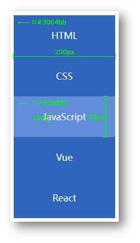
<!DOCTYPE html>
<html lang="en">
  <head>
    <meta charset="UTF-8" />
    <meta name="viewport" content="width=device-width, initial-scale=1.0" />
    <title>热词</title>
    <style>
      a {
        display: block;
        width: 200px;
        height: 80px;
        background-color: #3064bb;
        color: #fff;
        /* 水平居中 */
        text-align: center;
        /* 垂直居中 */
        line-height: 80px;
        font-size: 18px;
        /* 去掉下划线 */
        text-decoration: none;
      }

      a:hover {
        background-color: #608dd9;
      }
    </style>
  </head>

  <body>
    <a href="#">HTML</a>
    <a href="#">CSS</a>
    <a href="#">JavaScript</a>
    <a href="#">Vue</a>
    <a href="#">React</a>
  </body>
</html>
热词 - banner 效果

<!DOCTYPE html>
<html lang="en">
  <head>
    <meta charset="UTF-8" />
    <meta name="viewport" content="width=device-width, initial-scale=1.0" />
    <title>banner 效果</title>
    <style>
      .banner {
        height: 500px;
        background: #f3f3f4 url("https://s2.loli.net/2023/08/25/9yl57GQVH6sbOKx.png") left bottom no-repeat;

        text-align: right;
        color: #333;
      }

      .banner h2 {
        font-size: 36px;
        line-height: 100px;
      }

      .banner > p {
        font-size: 20px;
      }

      a {
        display: inline-block;
        width: 125px;
        height: 40px;

        background-color: #f06b1f;
        color: #fff;
        font-size: 20px;
        text-align: center;
        line-height: 40px;
        text-decoration: none;
      }
    </style>
  </head>

  <body>
    <div class="banner">
      <h2>让创造产生价值</h2>
      <p>我们希望小游戏平台可以提供无限的可能性,让每一个创作者都可以将他们的才华和创意传递给用户。</p>
      <a href="#">我要报名</a>
    </div>
  </body>
</html>